- جدید
- ناموجود


توجه : درج کد پستی و شماره تلفن همراه و ثابت جهت ارسال مرسوله الزامیست .
توجه:حداقل ارزش بسته سفارش شده بدون هزینه پستی می بایست 100000 ریال باشد .
توجه : جهت برخورداری از مزایای در نظر گرفته شده برای مشتریان لطفا ثبت نام نمائید.
|
|
|
 |
|
| Category | Serif |
|---|---|
| Classification | Vox-ATypI: Didone British: Didone Bringhurstian: Romantic |
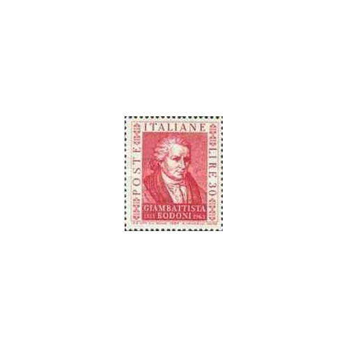
| Designer(s) | Giambattista Bodoni |
| Variations | Berthold Bodoni Antiqua LTC Bodoni 175 Linotype Bodoni Bauer Bodoni Filosofia |
| Shown here | ITC Bodoni Seventy Two |

Bodoni is the name given to the serif typefaces first designed by Giambattista Bodoni (1740–1813) in the late eighteenth century and frequently revived since.[1] Bodoni's typefaces are classified as Didone or modern. Bodoni followed the ideas of John Baskerville, as found in the printing type Baskerville: increased stroke contrast reflecting developing printing technology and a more vertical axis, but took them to a more extreme conclusion. Bodoni had a long career and his designs evolved and varied, ending with a typeface of a slightly condensed underlying structure with flat, unbracketed serifs, extreme contrast between thick and thin strokes, and an overall geometric construction.[2]
When first released, Bodoni, and other didone fonts, were called classical designs because of their rational structure. However, these fonts were not updated versions of Roman or Renaissance letter styles, but new designs. They came to be called 'modern' serif fonts and then from to mid 20th century they were known as Didone designs.[3] Though Bodoni's later designs are rightfully called "modern", the earlier designs are "transitional".
Some digital versions of Bodoni are said to be hard to read due to "dazzle" caused by the alternating thick and thin strokes, particularly as the thin strokes are very thin at small point sizes. This is very common when optical sizes of font intended for use at display sizes are printed at text size, at which point the hairline strokes can recede to being hard to see. Versions of Bodoni that are intended to be used at text size are "Bodoni Old Face", optimized for 9 points; ITC Bodoni 12 (for 12 points); and ITC Bodoni 6 (for 6 points).
Massimo Vignelli stated that 'Bodoni is one of the most elegant typefaces ever designed.'[4] In the English-speaking world, 'modern' serif designs like Bodoni are most commonly used in headings and display uses and in upmarket magazine printing, which is often done on high-gloss paper that retains and sets off the crisp detail of the fine strokes. In Europe, they are more often used in body text.
تشکر نظر شما نمی تواند ارسال شود
گزارش کردن نظر
گزارش ارسال شد
گزارش شما نمی تواند ارسال شود
بررسی خود را بنویسید
نظر ارسال شد
نظر شما نمی تواند ارسال شود

check_circle
check_circle
